Creating a peaceful and relaxing environment at home often starts with the colors you choose for your walls, furniture, and accessories. Calm colors can help reduce stress, improve mood, and make your space feel more inviting. Whether you’re redecorating a single room or your entire home, selecting the right colors is key to creating a serene atmosphere.
In this post, we’ll explore practical tips for choosing calm colors along with examples and ideas that work well in any home.
Why Choose Calm Colors?
Calm colors typically have muted tones, soft hues, and low saturation. These colors are known to have a soothing effect on the mind and body. They can:
– Promote relaxation and reduce anxiety
– Improve focus and creativity
– Enhance natural light and space perception
– Create a balanced and harmonious look
Some common calm color families include soft blues, gentle greens, warm neutrals, pastel pinks, and light grays. But how do you decide which one will work best for your home?
Tips for Choosing Calm Colors
1. Consider the Purpose of Each Room
Different rooms serve different functions, so it’s essential to match color choices with the room’s purpose.
– Living Room: Choose colors that foster conversation and comfort, like soft blues or warm taupes.
– Bedroom: Go for relaxing tones such as muted greens, lavender, or pale grays to encourage restful sleep.
– Kitchen: Soft yellows or mint greens can make the space feel fresh and inviting without overwhelming.
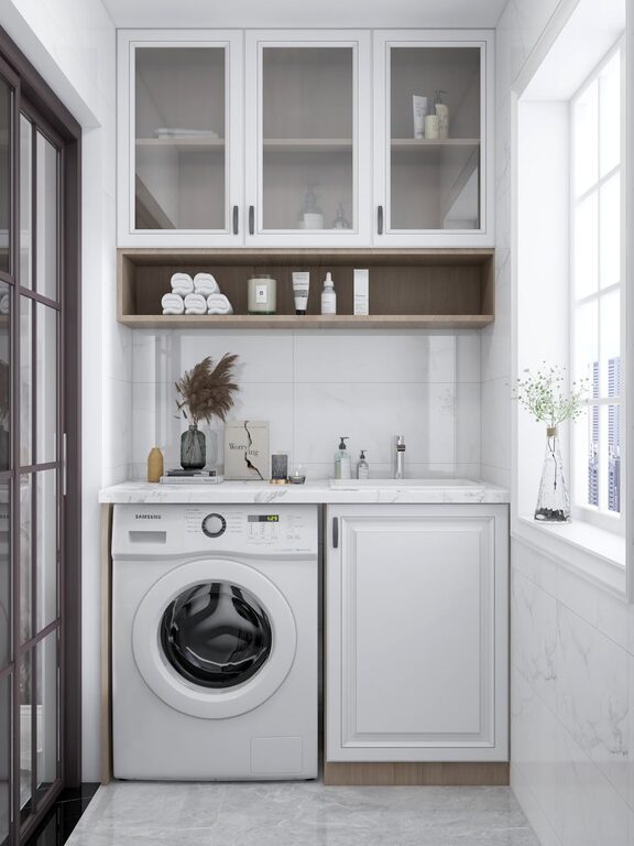
– Bathroom: Light blues or seafoam greens create a spa-like and calming atmosphere.
2. Use a Color Palette for Balance
Rather than using just one color, create a palette of 2-4 complementing calm colors. This adds depth and keeps the space interesting.
– Pick a dominant color for walls or larger items.
– Add secondary softer hues for furniture or accents.
– Use neutrals like beige, cream, or white to break up the colors and maintain airiness.
3. Test Colors in Different Lighting
Lighting affects how colors look. Natural daylight and artificial lighting can change tones dramatically.
– Paint sample patches on your walls and observe them multiple times during the day.
– Use portable paint swatches to compare colors under your home’s lighting.
– Remember that north-facing rooms often benefit from warmer calm colors to counter cooler light.
4. Choose Colors with a Matte Finish
Glossy or shiny finishes reflect more light and may feel less relaxing. Matte or eggshell finishes provide a soft, muted look that enhances calmness.
– Apply matte paint for walls and large surfaces.
– Use satin or semi-gloss finishes sparingly on trims or cabinets for subtle contrast.
5. Incorporate Natural Elements
Pair calm colors with natural materials like wood, stone, and plants.
– These elements complement soft colors and add texture.
– Natural greens and browns bring tranquility and warmth to your interiors.
6. Avoid Overly Bright or Intense Shades
Vivid colors like bright reds, neon yellows, or electric blues tend to energize and stimulate rather than calm.
– If you like bright colors, use them gently as accent pieces rather than dominant hues.
– Stick to desaturated or pastel versions of your favorite bold colors to keep the tone relaxed.
7. Use Color Psychology as a Guide
While personal preference always rules, color psychology can offer helpful insights:
– Blue: Often associated with calmness, trust, and serenity.
– Green: Linked to nature, balance, and renewal.
– Lavender: Connected to relaxation and stress relief.
– Beige/Gray: Neutral, versatile, and grounding.
– Soft Pink: Gentle, nurturing, and peaceful.
Popular Calm Color Ideas
Here are some popular calm color options and how you might use them:
| Color Name | Description | Best Used In |
|—————–|——————————|———————–|
| Pale Blue | Light and airy, evokes sky | Bedroom, bathroom |
| Sage Green | Soft, earthy green shade | Living room, kitchen |
| Warm Taupe | Neutral with a hint of warmth| Living room, hallway |
| Light Gray | Cool, modern and versatile | Office, bedroom |
| Blush Pink | Soft and whimsical pink | Nursery, bedroom |
| Creamy White | Warm white with subtle yellow| Any room |
How to Incorporate Calm Colors in Your Decor
Walls and Ceilings
Start with a calm paint color for walls and ceilings. Lighter shades reflect natural light and make spaces feel open and fresh.
Furniture and Fabrics
Choose upholstered pieces in calming tones. Soft fabric textures like linen or cotton complement muted colors perfectly.
Accessories and Art
Use throw pillows, rugs, curtains, and artwork to bring in calm color accents. This is an easy way to update the color scheme without major changes.
Plants and Natural Touches
Add potted plants or floral arrangements to bring the calming power of nature indoors.
Final Thoughts
Choosing calm colors for your home is an excellent way to foster a tranquil and welcoming atmosphere. By considering the function of each room, using balanced palettes, testing under different lighting, and incorporating natural materials, you can create spaces that feel restful and inviting.
Remember, the best calm colors are the ones that make you feel comfortable and happy in your own space. Take your time exploring options and enjoy the process of making your home your peaceful retreat.
—
If you found these tips helpful, feel free to share your own favorite calm colors in the comments below!